
安全工程专业课程
安全仿真与模拟基础
金洪伟 & 闫振国 & 王延平
西安科技大学安全科学与工程学院
如何浏览?
- 从浏览器地址栏打开 https://zimo.net/aqmn/;
- 点击章节列表中的任一链接,打开相应的演示文稿;
- 点击链接打开演示文稿,使用空格键或方向键导航;
- 按f键进入全屏播放,再按Esc键退出全屏;
- 按Alt键同时点击鼠标左键进行局部缩放;
- 按Esc或o键进入幻灯片浏览视图。
请使用最新版本浏览器访问此演示文稿以获得更好体验。
第 3 部分 基于 Python 进行科学计算
第 3 章 Matplotlib
数据可视化
目 录
1. Matplotlib 介绍
1.1 概述
- 创建达到可出版质量的图形;
- 制作可交互式缩放、平移和更新的图形;
- 自定义视觉样式和布局;
- 导出为多种文件格式;
- 嵌入到 JupyterLab 和图形用户界面;
- 使用基于Matplotlib 构建的丰富的第三方包。
4.1 安装 Matplotlib
使用 pip 安装:
pip install matplotlib
使用 conda 安装:
conda install -c conda-forge matplotlib
4.2 绘制第一幅图
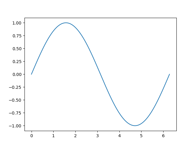
Matplotlib 在 Figure 上绘制数据,每个 Figure 可能包含一个或多个 Axes,Axes 是一个可以用 x-y 坐标(或极坐标图形中的 theta-r,3D 图形中的 x-y-z,等等)来指定点的区域。创建一个带 Axes 的 Figure 的最简单方法是使用 pyplot.subplots。然后可以使用 Axes.plot 在 Axes 上绘制数据:
            import matplotlib.pyplot as plt
            import numpy as np

            x = np.linspace(0, 2 * np.pi, 200)
            y = np.sin(x)

            fig, ax = plt.subplots()  # 创建一个包含一个 Axes 的 Figure 对象.
            ax.plot(x, y)  # 在 Axes 上绘制数据.
            plt.show()  # 显示此 Figure 对象.
4.3 Figure 的组成
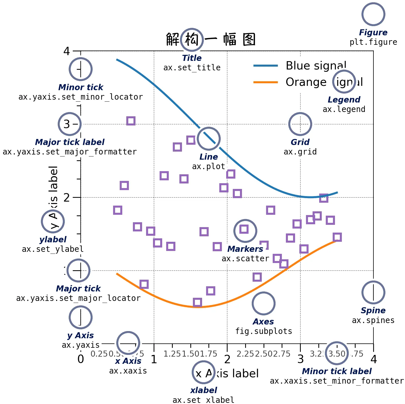
实用翻译:
- Figure: 图形
- Axes: 坐标系统
- Axis: 坐标轴
- Title: 标题
- Legend: 图例
- Line: 线条
- Markers: 标记
- Tick: 刻度线
- Tick label: 刻度标签
- x-label: x 轴标签
- Grid: 网格
- Spine: 边界线
4.3 Figure 的组成
❶ Figure
代表整个图形。Figure 追踪所有子 Axes、一组“特殊的”Artist(标题、图例、色标等),甚至嵌套的子图形。
创建一个新 Figure 的最简单方法是使用 pyplot:
            fig = plt.figure()  # 一个没有 Axes 的空图形
            fig, ax = plt.subplots()  # 一个带有单个 Axes 的图形
            fig, axs = plt.subplots(2, 2)  # 一个带有 2x2 的 Axes 网格的图形
            # 图形的左侧有一个轴,右侧有两个轴:
            fig, axs = plt.subplot_mosaic([['left', 'right_top'],
                                        ['left', 'right_bottom']])
为方便起见,经常在创建 Figure 的同时就创建 Axes,但也可以在此后再添加 Axes。
4.3 Figure 的组成
❷ Axes
Axes 是一个绑定在 Figure 上的 Artist,相当于坐标系统。Figure 包含一个用户绘制数据的区域,通常包含 2 个(在 3D 时是 3 个)Axis 对象(注意 Axes 和 Axis 是不同的)以提供刻度线(tick)和刻度标签(tick label),他们可以为 Axes 中的数据提供刻度。每个 Axes 也有一个标题(可通过 set_title() 设置),一个 x 轴标签(x-label,可通过 set_xlabel() 设置),一个 y 轴标签(y-label,可通过 set_ylabel() 设置)。
Axes 类及其成员函数是使用 OOP 接口的主要入口点,他们定义了大多数绘图方法(例如,前面的 ax.plot() 就是个绘图方法)。
4.3 Figure 的组成
❸ Axis
这些对象设置刻度及其值的范围,并生成刻度线和刻度标签。刻度线的位置由一个 Locator 对象决定,刻度标签字符串通过一个 Formatter 进行格式化。可以通过 Locator 和 Formatter 组合对刻度进行细微的调节。
❹ Artist
在 Figure 上所有可见的一切都可算作 Artist(甚至 Figure、Axes 和 Axis 对象也是)。这些包括 Text 对象、Line2D 对象、集合对象、Patch 对象等。当渲染 Figure 时,所有 Artist 都会被绘制到画布上。多数 Artist 都依附 Axes 存在,这些 Artist 不能被多个 Axes 共享,也无法从一个 Axes 移动到另一个。
4.4 绘图函数的输入类型
绘图函数要求的输入类型为 numpy.array 或 numpy.ma.masked_array,或是能被传递给 numpy.asarray 的对象。其他类似数组的类,如 pandas 数据对象和 numpy.matrix 可能不会正常工作。一般会在绘图前将这些数据转换为 numpy.array 对象。以下是一个转换 numpy.matrix 的示例:
            b = np.matrix([[1, 2], [3, 4]])
            b_asarray = np.asarray(b)
多数方法也可以解析可寻址对象,如字典(dict)、numpy.recarray 或 pandas.DataFrame。Matplotlib 允许允许提供 data 关键字参数,并进一步通过传递对应于 x 和 y 变量的字符串生成图形。
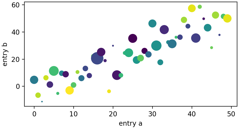
4.4 绘图函数的输入类型
            np.random.seed(19680801)  # 为随机数生成器取种.
            data = {'a': np.arange(50),
                    'c': np.random.randint(0, 50, 50),
                    'd': np.random.randn(50)}
            data['b'] = data['a'] + 10 * np.random.randn(50)
            data['d'] = np.abs(data['d']) * 100

            fig, ax = plt.subplots(figsize=(5, 2.7), layout='constrained')
            ax.scatter('a', 'b', c='c', s='d', data=data)
            ax.set_xlabel('entry a')
            ax.set_ylabel('entry b')
            plt.show()
4.5 编码风格
❶ 显式和隐式接口
可以通过两种方式使用 Matplotlib:
- 显式的 OO 风格:显式创建
Figure和Axes,并调用他们的方法。 - 隐式的 pyplot 风格:依赖
pyplot隐式创建和管理Figure和Axes,并使用pyplot函数绘图。 - 彻底不用
pyplot,仅在将 Matplotlib 嵌入到图形用户界面程序时使用。(不再讨论)
隐式的 pyplot 风格更方便使用,但在绘制复杂图形时,更推荐使用显式的 OO 风格。
4.5 编码风格
显式的 OO 风格:
            x = np.linspace(0, 2, 100)  # 数据采样

            # 注意即便使用 OO 风格,也要使用 `.pyplot.figure` 创建 Figure。
            fig, ax = plt.subplots(figsize=(5, 2.7), layout='constrained')
            ax.plot(x, x, label='linear')  # 在 Axes 上绘制数据
            ax.plot(x, x**2, label='quadratic')  # 在 Axes 上绘制更多数据
            ax.plot(x, x**3, label='cubic')  # ... 更多
            ax.set_xlabel('x label')  # 为 Axes 添加 x 轴标签
            ax.set_ylabel('y label')  # 为 Axes 添加 y 轴标签
            ax.set_title("Simple Plot")  # 为 Axes 添加标题
            ax.legend()  # 添加图例
            plt.show()
4.5 编码风格
隐式的 pyplot 风格:
            x = np.linspace(0, 2, 100)  # 数据采样

            plt.figure(figsize=(5, 2.7), layout='constrained')
            plt.plot(x, x, label='linear')  # 在(隐式的)Axes 上绘制数据
            plt.plot(x, x**2, label='quadratic')  # 其他
            plt.plot(x, x**3, label='cubic')
            plt.xlabel('x label')
            plt.ylabel('y label')
            plt.title("Simple Plot")
            plt.legend()
            plt.show()
4.5 编码风格
❷ 编制辅助函数
如果要使用不同数据集多次绘制同一类图形,或更方便地封装 Matplotlib 方法,推荐使用如下形式的签名:
            def my_plotter(ax, data1, data2, param_dict):
                """
                一个生成图形的辅助函数。
                """
                out = ax.plot(data1, data2, **param_dict)
                return out

            data1, data2, data3, data4 = np.random.randn(4, 100)  # 生成 4 组随机得数据集
            fig, (ax1, ax2) = plt.subplots(1, 2, figsize=(5, 2.7))
            my_plotter(ax1, data1, data2, {'marker': 'x'})
            my_plotter(ax2, data3, data4, {'marker': 'o'})
            plt.show()
4.6 定义样式
多数绘图方法具有针对 Artist 的设置样式选项,可以在调用绘图方法时设置这些选项,或通过调用 Artist 的设置器(setter)方法。在如下的图形中,我们在创建图形时手动地设置 Artist 颜色、线宽、线型,并在之后通过 set_linestyle 方法设置第二条线的线型。
            data1, data2 = np.random.randn(2, 100)
            fig, ax = plt.subplots(figsize=(5, 2.7))
            x = np.arange(len(data1))
            ax.plot(x, np.cumsum(data1), color='blue', linewidth=3, linestyle='--')
            l, = ax.plot(x, np.cumsum(data2), color='orange', linewidth=2)
            l.set_linestyle(':')
            plt.show()
4.6 定义样式
❶ 颜色
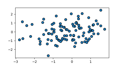
Matplotlib 定义了一组非常灵活的颜色,可用于大多数 Artist,详情请见颜色教程。一些 Artist 会接受多个颜色。例如,对于散点图,标记的内部和边界的颜色应该是不同的:
            data1, data2 = np.random.randn(2, 100)
            fig, ax = plt.subplots(figsize=(5, 2.7))
            ax.scatter(data1, data2, s=50, facecolor='C0', edgecolor='k')
            plt.show()
4.6 定义样式
❷ 线宽、线型和标记尺寸
线宽的单位是印刷术上的点(1 点 = 1//72 英寸),线宽可用于所有具有笔触线的 Artist。笔触线同样还具有线型。
标记尺寸由所用的方法决定。plot 以点为单位指定标记尺寸,并且通常是标记的直径或宽度。scatter 所指定的标记尺寸大致与标记的可视面积成正比。标记样式
Marker size depends on the method being used. plot specifies markersize in points, and is generally the "diameter" or width of the marker. scatter specifies markersize as approximately proportional to the visual area of the marker. There is an array of markerstyles available as string codes (see markers), or users can define their own MarkerStyle (see Marker reference):
            data1, data2, data3, data4 = np.random.randn(4, 100)  # 生成 4 组随机得数据集
            fig, ax = plt.subplots(figsize=(5, 2.7))
            ax.plot(data1, 'o', label='data1')
            ax.plot(data2, 'd', label='data2')
            ax.plot(data3, 'v', label='data3')
            ax.plot(data4, 's', label='data4')
            ax.legend()
            plt.show()
作业
作业
要求:
- 将本章全部作业放在一个
安模作业03-03-学号-姓名.py的源文件中,通过电子邮件以附件形式发给任课教师。 - 在源文件中以注释的形式醒目地写明本次作业对应的章编号、各个作业题的编号,并按要求写出解题思路、代码注释。
- 以上各题不能只有文字说明,而应同时有可执行的示例代码。
- 邮件标题统一用
安模作业03-03-学号-姓名的形式。 - 所有关于作业的回答都以代码注释的形式写在源文件中,不需要再额外附加其他文档或图片,请保证代码执行不会发生错误。
- 待本次作业批改后,请通过此链接下载本次作业的参考答案。